Talk radio is an odd duck - but at its core are people’s stories. Is this why I love user research? Maybe. Let’s dig into this awkwardly autobiographical thought
Read MoreCreativity (in UCD)
Recently we went to Billund and visited the Lego House - which was brilliant. Alongside the heaps of bricks and nostalgia there were quotes and parts of the brand’s philosophy on play. In the museum bit I read something that’s been bouncing around my head which I’m now going to bastardise:
Everyone is born creative.
We just express it differently.
And some of us need different triggers to unlock it.
Which sounds obvious. Almost annoyingly so - but it’s not trite. It’s clear and when you think about it a bit more you understand a bit more how people perceive the world.
And yet… most of us walk around thinking we’re either “creative” or we’re not. Like it’s a personality trait. Or a job title. I certainly wouldn’t put myself into a “creative” bracket - although I’ve been assured by peers and those that know me that I actually can be pretty creative.
However I’m not the only one that doesn’t perceive their own creativity at first glance.
“Oh I’m not the creative one.”
“That’s more of a design thing.”
“Let’s get someone in to make this look good.”
Even in UCD. Even in teams literally built around understanding humans.
We quietly box creativity off. Give it a seat over there. Usually next to Figma or the beardy designers that fawn over specific pens - you know the exact ones.
And the rest of us crack on being sensible, with spreadsheets, slide decks, snarky memes and such. But that doesn’t really hold up when you look at the work. Because creativity in the product design space isn’t just making things look nice. It’s in the weird, messy, slightly unpredictable bits and how things all work together.
It’s when you take a problem that everyone’s been nodding along to… and realise it’s the wrong problem entirely.
It’s when you ask a question in an interview that wasn’t on your discussion guide, follow the user down a rabbit hole, and suddenly everything opens up to an entirely different wonderland.
It’s when you’re in a workshop, it’s going sideways, and you somehow find a way to pull it back without anyone really noticing - pulling all the strings majestically like the Doctor saving the world in a savvy speech with an appropriate score.
That’s creative.
We just don’t give it that label because our perceptions of creativity can be limited to the arts in the way we were taught at school.
Creativity doesn’t just show up at the end of a project in the outputs. Nice journey maps. Clean personas. A deck that doesn’t make people want to quietly close their laptop and walk into the sea.
And don’t get me wrong - I still love that stuff. There’s craft in it, hard craft indeed - which is why my persona and slide templates follow me from gig to gig. But it’s not where the magic is.
The magic is earlier. And scrappier and has nothing to do with TV magician and pox upon our houses Stephen Mulhern.
It’s in the half-formed thoughts. The slightly chaotic workshops. The moments where you’re not entirely sure if what you’re doing is going to work.
It’s in taking a bunch of messy conversations with users and somehow turning them into something that actually means something to a team.
It’s the conversion of “here’s what we heard” to explaining“here’s what this changes” - in a way that’s engaging to multiple audiences.
Pivoting and adjusting, understanding and interpreting - that’s creative.
Ok, I know that “everyone’s creative” can sound trite, but what really stuck with me was the second part: We all need different triggers.
Because some people can sit quietly with a problem and just… think their way through it. I thought I was one of those people, turns out I’m not. I need to be moving around and distracting myself to get into flow state. If I sit still for too long, I start checking emails, planning ahead and basically being anywhere but present.
My version of creativity is much more… chaotic. It’s movement. It’s a Kerrang 2004 playlist whilst throwing post-its at a wall, it’s not always physical (although a walk helps), but it’s channelling freneticism. Jumping between ideas. Letting things collide. Pulling something from one place and dropping it somewhere else just to see what happens like a toddler discovering bath bombs.
A comment from a user turns into a metaphor.
A messy workshop becomes the start of a strategy or a strained metaphor - content onion anyone?
A throwaway thought becomes a whole direction of travel.
It doesn’t look tidy. It’s definitely not linear - but it makes sense and can be cleared threaded.
And then there’s making.
Not the polished, “ta-da, here’s the final thing” kind with a great unveiling via ‘can you see my screen?’
The working out. The bad sketches. Half-written narratives. Scratchy chicken writing. Diagrams that only make sense to you (and even then, only just). The moment you put pen to paper (or pencil, or stylus…) it pushes back. It gives you something to react to.
And suddenly you’re not stuck anymore.
This is the bit I think we miss in UCD.
We’re surrounded by creative opportunities.
User interviews.
Workshops.
Ambiguous, slightly uncomfortable problems.
Each of these can be made to be creative and engaging - useful for yourself.
Interesting stuff, the stuff that actually shifts thinking, rarely comes from just following processes - it comes from following the flow and energy of a task.
How you listen.
How you question.
How you connect things that don’t obviously go together.
How you wrap them all up together.
That’s the creative bit - the structure is a canvas, how you approach it is up to you.
So maybe the question isn’t “am I creative?”
That feels a bit binary and blunt.
Maybe it’s: “What makes the way I approach this different?”
Is it talking things out?
Writing?
Sketching?
Arguing (nicely)?
Letting your brain wander for a bit longer than feels productive?
Because once you know that, you can lean into it.
I’m a lot less interested now in whether something looks “creative” from the outside and a lot more interested in whether it unlocked something.
Everyone’s born creative - yes it sounds trite, but it’s true - it’s just finding the way to unlock it.
”What would you say you do here?” - Is ‘user researcher’ the right term anymore?
In Office Space there’s a brilliant scene where two consultants come in to a organisation to help downsize the company. The 2 Bobs, one of which is a very intense John C. McGinley (Doctor Cox from Scrubs) ask the protagonist of the film what he actually does. It’s cutting and brilliant in its bluntness.

However when I talk to people outside my sphere I sometimes struggle to talk about what I do as a user researcher. I don’t think I have a Chandler Bing job (nobody understands what he does), nor do I think user research falls into the tranch of bullshit jobs, but ‘user researcher’ doesn’t really say what the job is.
The term feels… serviceable.
Clear enough to get you in the room. Vague enough that half the room still doesn’t really know what you do. And to some you’re there just because someone higher up says ‘you need a researcher.’
I think the title worked in the past, but after discussions with my peers I think it might need revisiting, because the work has evolved and the term ‘user researcher’ doesn’t really say what we do anymore.
There was a time when user research sat neatly in a lane. You ran studies. You gathered insight. You handed it over. Superfriends high-5 with the rest of the design team. Then on to the next.
But that’s not how it plays out anymore.
Now we’re in the room earlier - or at least we SHOULD be. When we’re working at our best we’re helping define the problem before it’s even agreed that there is a problem. We’re shaping direction, not just informing it. We’re still there at delivery, watching what actually happens when things hit the real world.
There isn’t a clean handover in responsibility, we’re like annoying helicopter parents with consistently open questions.
There is no “done done” anymore, even though that’s what our tickets say.
The role has stopped being just about research.
So what would you say we do here now…?
What we actually do day-to-day (or at least me, and despite my inflated ego I doubt I’m unique), it doesn’t fit neatly into a single box anymore.
Some days, it looks like design. Not in the artefact sense, but in the shaping of intent. Figuring out what this thing should be, before anyone gets near a wireframe. Defining constraints. Deciding we’re building with digital LEGO over digital clay or digital meccano. We’re understanding trade-offs. Creating clarity where there wasn’t any. That doesn’t fit under ‘user researcher’.
That’s architecture, in a very real sense. Just not the kind with planning permission and drawings on fancy blue paper.
Other days, it looks like storytelling.
Not the fluffy kind. The kind that carries weight. The talking through of bad journeys which can stop users getting the help they need. The stories that bring up why the work is so important. I myself have interviewed gambling addicts, victims of modern slavery and the recently bereaved - making their voices heard is an incredibly important part of the job.
Don’t get me wrong - there’s also brilliant stories of saving up to buy the perfect pair of shoes or seeing the joy in a data architect’s face when an API just works…
But those voices need to be represented and threaded into a clear and actionable narrative. Because insight doesn’t do anything on its own. It just sits there, technically correct, strategically ignored to die on Confluence.
We build narratives. We create tension. We show consequences. We make it land in rooms full of competing priorities and louder voices.
We’re not just saying “this is what users said”. Although I definitely include verbatim quotes.
We’re shaping how a team understands reality. And a lot of the time, whether we say it out loud or not, we’re shaping decisions.
That’s the throughline. Not outputs. Not decks. Not perfectly crafted artefacts that get politely nodded at or get a ghostly thumbs up at on a Teams call and quietly forgotten.
User researchers should be at the core at driving decisions.
What do we do next?
What do we not do?
Where do we place our bets?
Who do we need to speak to?
If the work isn’t influencing that, then it might be interesting but it’s not impactful.
So… back to the name.
“User researcher” still works, in the same way an old map still works. You’ll probably get where you’re going, but you’ll miss a lot along the way. The industry likes a clean label. Something you can put in a job description. Something you can hire for. Something that fits neatly into a capability model.
But the role itself is stretching:
Up into strategy.
Sideways into design and product.
Across into delivery and iteration.
Trying to compress that into two words at best feels… optimistic.
Maybe the more useful shift isn’t the title, but the stance we take.
Less: “I do research”
More: “I help teams make better decisions about people”
It’s a subtle shift, but it changes everything.
You’re not handing over insight anymore. You ride or die with the consequences.
Of course, we can’t resist naming things.
So if we were to try and capture it:
User need architect.
Decision intelligence partner.
Experience strategist.
Human insight lead.
Narrative operator.
Product sensemaker.
Vibe architect.
None of them quite land. All of them are reaching for something the current title just doesn’t get.
The real question isn’t what we call ourselves. It’s whether we’re willing to step into what the role is becoming. Well, that and do recruiters know what I do so they can find me?
More influence means more responsibility which we take on by working with teams.
More proximity to decisions means more challenge which we’re ready to take on with stories and data.
Less room to sit comfortably behind “I just drink unhealthy amounts of Monster and ask questions.”
That shift isn’t about semantics. It’s about posture. The title will catch up. It always does. And you can guarantee some weirdo on LinkedIn will claim they coined it in 2002.
But right now, there’s a gap between what the role is called and what the role actually is.
The Big Problem with User Research
The Research Is Good. So Why Is Nothing Changing?
I've had a version of the same conversation about 5 or 6 times in the last few months with senior leaders.
Different people. Different organisations. Different sectors. But the same frustrated and dejected look when they day it.
"The research is good. The methodology is good. We have solid practitioners. But nothing moves. The findings go in a deck, the deck gets shared around, there’s a sparsely attended playback meeting, and then... it just sort of disappears."
So if researchers are doing good work - why does nobody care? Why are we commissioning researchers to go out, speak to people, do analysis, and then just scream into the void in 20pt Arial?
The problem is that researchers aren’t telling engaging stories.
Researchers are brilliant. Nobody's taught them to narrate.
The profession has matured enormously. The methods are more varied. We have dedicated res:ops tools! My mind would have melted had I been given Condens and Rally in 2015. Research is more embedded than it's ever been. And yet the findings still die in a deck that nobody finished reading, ferreted away in Confluence to remain untouched.
Not because the work isn't credible. Not because the stakeholders don't care. But because gathering evidence and telling the story of it are completely different skills and almost nobody is deliberately trained in the second one - the assumption is that good work should speak for itself. It doesn’t.
We spend a lot of time talking about insight quality. Almost no time on what happens after the insight exists.
And then we're baffled when nothing changes.
Data and slide decks don’t inspire change. I cannot stress this enough.
I know this sounds a bit trite and obvious, but it's true, it keeps happening, so here we are.
The most effective communicators in any field lead with a human moment and follow with the evidence. Not the other way around. They know something researchers often don't: the brain doesn't feel a statistic. It feels a person's experience. The statistic is what makes that feeling defensible.
This is why I bring people out to do research with me - so colleagues and stakeholders SEE the user. See the struggles. See the frustration. See the opportunity. But not everyone can go out to be in every research session, so when a playback opens with "67% of users struggled with the navigation" — that's starting in entirely the wrong place.
Start with the person. Bring their stories to life.
I use personas, mindsets, archetypes, videos - anything to bring the people you’re building for in to the room.
The four things I see going wrong, specifically (and then backed up by senior people)
1. The findings are presented like a report, not argued like a case
Theme one. Theme two. Theme three. Recommendations. End. Massive appendix to go untouched.
A report is a container. A story is an argument. Those are not the same thing. Artefacts vs feeling.
The argument is: here's what's happening, here's why it matters, here's what's at stake if nothing changes, here's what we do about it. In that order.
Researchers are trained to separate analysis from interpretation rightly but as a narrative structure, it's genuinely terrible. You end up with a rigorous document that nobody acts on and everyone admires briefly before moving on.
2. One playback for everyone
A head of product needs to know what decision to make on Monday. A leadership team needs to understand their exposure to risk. A delivery team needs to know what to build next sprint.
The same research can serve all three. But not with the same story. Different audiences need the same evidence translated through a completely different lens.
If you're doing one playback for the room, you're probably doing one playback that half-works for everyone and fully works for nobody.
3. All the emotion has been professionally removed
Neutral, measured, considered language. Because that's rigorous. Because that's professional. Because that's safe.
It's also utterly inert as a way of creating urgency.
Neutral language doesn't make a senior leader lean forward. It doesn't stick in anyone's head after the Zoom ends. Carefully removing emotion from findings also accidentally removes the point.
Users were frustrated. Users gave up. That's not a neutral fact. It's a problem. Present it like one.
(I say this as someone who has absolutely sat in rooms presenting neutral facts about frustrated people and then wondered why nothing happened. We've all done it. I can also share being the person being presented to - if it’s not engaging I’ll float away in my head.)
4. The 'so what' is left as homework
The classic sign-off: a list of recommendations, fairly hedged, fairly long, handed to the room to argue about and prioritise.
I get why it happens. Researchers don't want to overstep. They're trained to present options - not direction.
But there's a difference between overstepping into delivery and targeted effective advocacy. You can have a clear view on priority without taking the decision out of the room. Most stakeholders are quietly desperate for someone to give them a narrative anchor.
If you don't give them one, they'll make their own. And their version will almost certainly prioritise whatever was already on the roadmap.
This isn't a creativity problem
Storytelling is a craft. It is genuinely learnable. It is not some mysterious gift that some researchers were born with and others weren't.
But it requires deliberate practice. And right now most research teams aren't getting any. It's not in those grim 48 hour bootcamps. It's barely touched in most training programmes. It's assumed to emerge naturally from experience, and occasionally it does, for the people who stumble across it and take it seriously.
Meanwhile there are researchers doing genuinely excellent work watching their findings die on slide twelve.
What it looks like when it's working
When storytelling actually lands, a few specific things happen that usually don't.
Stakeholders start referencing participants by name in follow-up meetings. Not as data points. As people. "What does this mean for people like for Fred? Does Barney have the same problem?" That's when you know it's stuck.
Decisions move faster. Because the argument is clear, the urgency is felt rather than stated, and there's a natural next step rather than an open list of recommendations.
Research gets pulled in earlier. Because when people feel the value of it, they start asking for it proactively rather than treating it as a compliance exercise.
That's what closing the storytelling gap actually unlocks. Not prettier presentations. A completely different relationship between research and the rest of the organisation.
So what do you actually do about it?
Some of this can be addressed by individual researchers deliberately studying narrative structure, getting comfortable with a clear point of view, practising the muscle.
But the most durable fix is a cultural one. It requires someone to name the gap explicitly, give the team a shared language for it, and create the conditions to practise.
That's the work I do with research teams and the people who lead them. Not a lecture. Not a framework deck. I don’t just hand everyone Joseph Campbell’s “A Hero with a Thousand Faces” and do a mic-drop. (Or because it’s me, get everyone to download a meme generator and say ‘go do the memes’ - I don’t do just that.)
I’m developing a hands-on session, or a series of them that starts with the specific stories your team is already trying to tell and builds from there.
If you're recognising this in your organisation if that tired look is familiar I'm at jason@catseye.digital No hard sell, no lengthy proposal. Just a conversation about whether it's the right fit.
Your research is probably good. Let's make sure it actually speaks to people.
How I Actually Put User Research on a Sprint Board (Without Pretending It’s Magical or Making Everyone Hate Me)
There’s a weird myth in digital teams that user research exists in a separate dimension to delivery.
It’s not blocked by delivery. It’s not accountable to it. It’s just… hovering nearby. Observing. Judging. Occasionally descending from the clouds to drop a 60-slide deck on people who are just trying to get a button to work with supreme judgement.
Then sprint planning happens, the room goes quiet, and someone inevitably asks: “So… when does the research bit happen? What do the tickets say?”
This is how I avoid that conversation entirely. I put user research on the backlog, in the sprint, and into the delivery flow. No fake tickets. No pretending insight arrives on a rigid, magical schedule.
I break it into five chunks. They’re not sexy. They are, however, honest and perfectly cromulent tickets.
1. Recruitment & Research Ops
(The work everyone forgets is actually work)
If recruitment isn’t on the board, it doesn’t exist. And if it doesn’t exist, it magically becomes “Jason’s fault” when a study slips because we couldn't find the right people.
I ticket the admin. I ticket the hell that is research:ops.
Defining participant criteria: Actually getting the team to agree on who we’re talking to before I start looking.
The Approach: Are we using a panel? Are we being scrappy? Are we begging people on LinkedIn? Spoilers, I don’t recruit via LinkedIn, that’s just for shovelling my my memes.
The Ethics & Logistics: Consent, incentives, accessibility needs, and scheduling that works for real humans, not just our calendars.
The sign up log: I create a centralised sign up sheet with timings and links to all the notes and prototypes.
This makes the invisible work visible. It also forces trade-offs early. When the PO asks for 12 users by next Friday, I point at the board and ask: “Ok - what type of person do you want to speak to and who is helping me with this?”
2. Planning
(Where research becomes useful or stays vague)
This is the bit I protect the hardest. Before we talk to anyone, I want total alignment on the "North Star" questions. WHAT ARE WE ACTUALLY WANTING TO FIND OUT?
If we can’t explain why we’re doing the research in two sentences, we aren’t ready to do it.
Planning tickets usually cover:
The Decision Map: “If we learn X, we’ll do Y.”
The Discussion Guide: Not a script—a thinking tool. I know some people like beastly scripts but I avoid this like the plague.
The Design Triangle: Lining up with my content and interaction designers to ensure everything makes sense and we’re all comfortable with what we’re doing.
This avoids the dreaded “interesting but not actionable” feedback. I don’t want trivia; I want to unblock a developer. Although I will listen to the trivia.
3. Interviews & The "Wash-Up"
(Don't just run sessions, ANALYSE AS YOU GO!)
I never use a ticket that just says “Run interviews -> Done.” That’s a trap and it’s reductive.
Each interview ticket includes the session itself, but also the immediate wash-up. After a session, I want a 15-minute debrief with whoever was observing and anyone in the team who would like to learn about what we saw.
What surprised us?
What assumptions are currently wobbling?
What didn't land at all?
Didn’t Jason ask some brilliant questions?
By the time we get to the final analysis, the team already feels the research. They’ve heard the quotes. They’ve seen the struggle. I’m not dragging them to an "insight session" later; they were there when it happened.
4. Analysis
(Not a solo sport)
Analysis is where research either earns trust or quietly dies in a folder. I break it up because analysis isn't one singular "moment”, it’s sustained supported learning and understanding shared by the team.
Synthesis: Me pattern-spotting and sense-making with a brilliant soundtrack from 1999-2012
The Sanity Check: Reviewing with the UCD team to make sure I’m not just seeing what I want to see and what I’ve found passes the sniff test.
Meaning-Making: Sitting with product and design to decide what the research means and how we move forward.
I’m not chasing a perfect academic model. I’m chasing the confidence to act. If the output doesn’t change a decision, what’s the point?
5. Playback
(Same research, different shapes)
Playback isn’t “The Presentation.” It’s a series of translations.
On the board, I split this into different cuts for different audiences:
The Sprint Review: What we learned this sprint.
The Design Crit: Presenting concepts and findings to design nerds to rake it over the coals.
The Leadership Summary: Shorter than you think, focused on what the point of it is and what we’re going to do about it.
The Repository: For future humans who join the project in six months when people inevitably move on.
If you only do one playback, you’re optimising for yourself, not the real world.
Why I Bother Doing It This Way
Making research visible on the board stops it from being mysterious. It sets realistic expectations and makes the trade-offs explicit.
But mostly, it makes research feel like delivery, not an abstract aside.
I don’t want to be the person who turns up at the end with a list of "insights" that everyone is too busy to implement. I want to be part of how the team makes better decisions under pressure.
It’s not clever. It’s sharing research through visibility.
The Art of a Delivery Manager
I’ve worked with a lot of Delivery Managers (DMs).
Some were absolute structural engineers of sanity, logical creatures with emotional understanding.
Some were baffling, erratic and odd.
And some felt like they’d been deployed by the universe purely to test my patience and make me question everything in my life thus far - I still have the scars (metaphorically of course).
A DM can tilt a whole team’s universe, toward cohesion or chaos and most of the time, they don't even realise they're doing it.
The brilliant ones? They serve the team. They make themselves invisible, like a hidden Fat Controller. It’s trite and rolled out on podcasts to say ‘servant leader’ - but there’s something to it.
The awful ones? They see the word “manager” in their title and decide that they're the boss. They give off the the frantic, ego-driven stench of someone who applied for The Apprentice, didn’t get in, and has been performing to an imaginary camera crew ever since. Their business tiktok is gonna blow up any day guys.
The Best DMs Are Guardians of Culture
A good Delivery Manager doesn’t just keep the trains running. They are the guardians of the conditions the work needs to survive, they’re focusing on delivery and working with and for the team.
They’re the quiet custodians of the unglamorous essentials:
Psychological safety
Clarity of purpose
Conflict hygiene ("What we do when things go wrong")
Emotional temperature (noticing when someone sounds "off")
Ensuring the team have the right tools (I apologise profusely for getting locked out of JIRA…)
These people understand that culture isn’t a trite motto poster on a Teams background or an AI informed workshop. It’s the day-to-day weather. And they keep the skies clear like some kind of celestial bulldog.
You’ll find them:
De-escalating tension before anyone realises it existed (even me, the poster child of overthinking)
Blocking toxic noise from senior leaders who want to derail the team as it might stop their empire building.
Reminding everyone why we’re doing this, not just what we’re doing.
Setting a tone that the team naturally synchronises to.
A great Delivery Manager is a tuning fork. They don’t impose culture, they hold the frequency steady so the rest of us can lock into the work.
The Worst Ones Are Apprentice Rejects
Then there are the others. Yes I have list - no you can't see it.
The ones who treat delivery like an aggressive performance review conducted by Lord Sugar. They are the main character in the story of the project.
Their trademarks are loud, confident, and destructive:
Performative urgency (all caps emails).
Weaponised Kanban boards (boards used to shame, not inform).
Buzzword-driven ceremonies (meetings for the sake of metrics - No, I will not take this offline).
"Managing up" while the team quietly burns beneath them.
Treating impediments like plot twists they must dramatically announce - a 30 minute staff wide meeting to announce you’re not going to be in on Friday? True story.
They bring that Apprentice energy: loud confidence, minimal competence, and the deep belief that process is something you inflict on people. These DMs don't guard culture—they erode it by making the culture whatever mood they happen to be in that day.
The Best Ones Don’t Centre Themselves — They Centre the Work
Here’s the secret pattern I’ve seen again and again:
The brilliant ones aren't invisible - but they're not the main character. They're the amazing support character that makes everything click.
The terrible ones make themselves the main character and they think they’re in ‘Peaky Blinders’ or ‘Sex and the City’.
Great Delivery Managers don’t need to be the loudest voice in the room because they’re too busy listening and fixing. They don’t need to rack up personal "wins" because the team’s success is the only win that matters. They don't chase influence; influence naturally accrues to people who make other people calmer and more effective.
The Real Test: What Happens When Things Go Wrong
If you want to see the difference instantly, watch a team on a bad day: a massive bug, a sudden pivot, a critical deadline missed, Jason shouts at someone…
With a great DM:
Blame disappears.
The pace steadies.
Communication sharpens.
People lean in rather than scatter.
With a poor DM:
Chaos accelerates.
Decisions freeze.
Meetings multiply to assign "ownership."
"Ownership" becomes a weapon.
One is a culture keeper and a stabilizing force. The other is an accelerant of chaos.
The Big Takeaway
Don’t look at their frameworks. Don’t look at their dashboards. Don’t even look at how the sprint is going.
Look at the team.
Ask yourself: Do these people feel safe, clear, supported, and able to do their best work?
Or do they look like contestants bracing for Lord Sugar to point and say “You’re fired”?
That’s the difference. A great Delivery Manager makes the team feel more capable. A bad one just makes them feel observed.
The Firefighter Fallacy: Why User Research Needs to Break Hierarchies
There’s a quote that’s haunted me since I first read it in my first year at university, a Google search has told me that it’s attributed to Kenyan commentator Onyango Oloo:
“One New York firefighter is worth ten British bobbies, is worth a hundred Bosnians, is worth a thousand Rwandans, is worth ten thousand Africans dying in a civil war.”
It’s brutal. It’s also true. It captures the media’s quiet mental model, how proximity, nationality, and familiarity decide whose suffering counts. People care the most about those in their close surroundings.
And, like it or not, we do the same thing in user research.
We build our own hierarchy of grief. Our own hierarchy of what matters.
Some users get our attention, our empathy, our meticulously crafted Miro boards. There are stories I can recount now of speaking to victims of modern slavery and addiction, as well as happier tales like the ‘Chicken King’.
Others? They get written off as “edge cases.”
Or “not our target audience.”
Or, the worst one: “interesting, but not actionable.”
The Firefighter: The Convenient User
In our world, the “New York firefighter” isn’t the hero running into a burning building, it’s the easy user.
The articulate one.
The one who shows up on time to their remote interview with good lighting and a nice microphone. The one who is closest to home.
The one whose worldview doesn’t challenge ours too much.
They might be:
A stakeholder whose “gut feeling” somehow becomes a research insight.
An early adopter in London or San Francisco who looks suspiciously like your design team.
A squeaky wheel customer who’s always ever so helpful when engaging with the sales team.
A loyal power user who says nice things and validates your backlog.
They’re great, they make us feel productive. They’re some wonderfully juicy low hanging fruit. But if we only listen to them, we’re designing for a subsection, one journey, one experience.
That’s not insight; that’s self-affirmation with via Figma, homogenous Heroku.
The Silent Thousands
Then there are the people at the bottom of the hierarchy — the users who never make it onto your recruitment spreadsheet.
They’re:
The ones using your service on a broken Android 6 phone over 3G.
The ones who need a screen reader and can’t get past your cookie banner.
The ones who don’t speak your default language, but have no choice but to use your product as ‘98% of users speak a level of English’.
When they do appear in your dataset, as a small, lonely dot in a sea of “positive feedback” we call them outliers.
We literally flatten their struggle into a data point. An aberration to be turned into an anecdote, to a blip, to being cut out of the narrative.
Their pain becomes “low priority,” or worse, “for phase two.” Stuffed into the backlog to be revisited ‘at some point’, which we know, never happens.
That’s the real tragedy of poor research — not lives lost, but opportunities missed, markets ignored, trust eroded.
Rewriting the Hierarchy
We love to say “users are at the heart of everything we do,” but all users are equal and some users are more equal than others.
If your sample skews to the loud, the local, or the lovely, your insight isn’t wrong - it’s just incomplete.
And incomplete research builds brittle systems.
The real work is unglamorous:
Recruiting the inconvenient. The ones who cancel twice or need translation support. When working within the public sector, those who are afraid of engaging with government.
Designing for the edge cases first. Because that’s where resilience and innovation live.
Context over convenience. Get out from behind the Zoom call and into the actual environment where people are struggling.
That’s how we stop treating users like headlines — and start designing for the full storyThat’s how we stop treating users like headlines — and start designing for the full story.
Because in user research, our job isn’t to rank suffering.
It’s to listen to every voice and actually hear them.
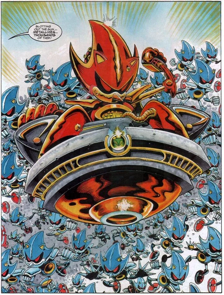
The Art of Interpretation, Sonic the Hedgehog and UX Storytelling
There are many Sonics.
I’ve fallen down the 90s nostalgia trap that is Sonic the Comic the Podcast, where the hosts go through every issue of Sonic the Comic. For me it is the definitive version of the blue hedgehog, however my opinion isn’t wholly common online. In recent years I’ve found out that many people don’t appreciate Fleetway’s take - and it’s reminded me just how many wildly different versions of the world’s fastest hedgehog exist.

There’s the cocky, anti-authoritarian 90s icon we all grew up with and marketed to within an inch of our lives.
The anxious, endearing movie Sonic who just wants a mate and some peace and sounds remarkably similar to Jean Ralphio…
The silent, existential runner from the games.
One character. A dozen narratives. Zero canonical truth.
And that, my friends, is basically user-centred design in a nutshell.
The value of what we make isn’t in the thing itself — it’s in what people do with it once it’s out there.
Stop Designing “The Final Product” (You’re Building a Starter Kit)
Design teams love to argue about canon.
What’s the real user journey?
What’s the one true tone of voice?
What’s “on brand”?
But users don’t care about your internal mythology.
They care about what actually helps them get through their day.
The second your product lands in someone’s world, amid the noise, kids, caffeine, browser tabs, and general chaos, it stops being your design.
They’ll use your beautifully crafted to-do app as a shopping list - that will slowly become abandoned.
They’ll turn your pristine comms tool into a meme dump, well I do anyway.
They’ll write their hopes, dreams, and expletives into the CRM notes field and then panic when they find out that it’s shared with the client (true story).
You designed a precision instrument. They’re using it as a hammer.
And honestly? If it still drives in nails, that’s a success story.
Fleetway Super Sonic: WHY Workarounds MEET USER NEEDS
Fleetway Super Sonic is what happens when a design gets broken on purpose — and ends up even more interesting.
Originally, “Super Sonic” was meant to be heroic and in most interpretations he still is.
Sonic the Comic didn’t know that though, they saw a wild yellow design and thought “What if it’s pure evil instead?”
Same material, same design. Different story. Better result (fight me.)

Your users do this all the time:
They build a 12-sheet spreadsheet to replace your expensive dashboard because their way ‘just feels better’.
They send each other unofficial “fixes” in Slack instead of logging tickets.
They take a photo of your QR code, print it out and share it amongst each other because the “share” function is buried three menus deep.
They’re breaking your design for reasons that make perfect sense to them - but in their minds they’re not breaking it - they’re working with it.
They’re not misbehaving - they’re using.
Sometimes the best insight you’ll ever get is watching someone completely ignore your instructions and still win.
Coherence Beats Consistency Every Time
When fans debate Sonic, they’re not arguing about quills or shoes — they’re arguing about vibe.
Does this feel like Sonic?
That’s coherence — and it’s the holy grail of design storytelling.
Consistency is keeping the logo the same size on every page.
Coherence is making sure the story still makes sense when someone uses your product upside down, backwards, or with a broken mouse.
If your brand promise is “we save you time,” but your user spends two hours trying to export data, the story falls apart.
Coherence is what lets your design flex and still feel true when it’s bent by reality.
Design Isn’t a Finish Line. It’s a Starting Line.
Your user is the final designer. Always has been.
Everything we make is just a set of invitations and affordances, a starter kit for behaviour we hope happens.
The best designs expect to be broken, stretched, hacked, and remixed.
So stop designing like you’re writing a novel.
Start designing like you’re building a sandbox and share your iterative plan.
Let people play with it, break it, rebuild it, and tell their own story with it.
If it still holds together after that, you’ve made something genuinely human.
In the End: Sonic Survives Because His Story Does
Sonic has survived decades of reboots, rebrands, and reinterpretations because his story is simple - run fast, jump on robots to free animals.
That core still holds up, no matter how weird it gets. The same story could be reinterpreted countless ways.
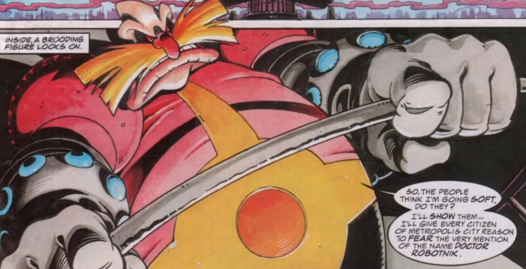
Evil scientist Doctor Robotnik (I’ll be long dead before I call him Eggman) is playing god, warping nature, enslaving innocents and remaking the world to his ideal automated hellscape.
A plucky band of environmentalists fight up against the man.
A hedgehog runs fast and jumps on robots.
Same source material - WILDLY DIFFERENT INTERPRETATIONS.
That’s the real UX storytelling lesson.
The story doesn’t have to be consistent, it just has to be true enough for people to keep making it their own.
Your product isn’t a sermon, let people play with it and get to their destination - play with it.

Spirit Halloween UX: UCD Lessons from the Chaos Pit
In 2009, I worked at a Spirit Halloween pop-up in Vancouver — ten chaotic weeks of polyester, smoke machines, and pure human behaviour. It was messy, temporary, and gloriously unhinged — but it taught me more about user-centred design than any agency job ever did. If your design can survive tired, emotional, costumed humans on a sugar rush, it can survive anything.
Read MoreYou Are All Weirdos (Or: You Are Not Your User)
We are all weirdos. The biggest mistake in design is assuming your own behaviour is "normal." This post breaks down how developer bias, civil servant norms, and even researcher assumptions derail products—and why embracing user weirdness is the only way to build services that actually work.
Read MoreWhen to Push Back (Or: Why I’m Not Welcome Back at [REDACTED])
Sometimes, user research isn't about finding new ideas—it's about killing bad ones. In this post, I share an honest story about why pushing back with evidence is the most important (and least popular) part of the job.
Read MoreNotes That Save Your Arse: What I Learned When the Recording Fails
Every researcher has experienced the sinking feeling of a failed recording. This post shares my hard-won methods for taking notes that save your project, from capturing key quotes to building a user's profile on the fly.
Read MoreA Bundle of Resources - Jason’s Basic Tools
I'm often asked about the tools I use for user research. My secret weapon isn't a slick app, but a set of hand-drawn templates I use to plan projects, run sessions, and report findings. In this post, I share my three core tools for keeping research honest and actionable.
Read MoreWho You Gonna Call? Why I Love Running Toward the Spooky Research Problems
Sometimes, a project feels haunted by unknowns. In this post, I explain why running toward that chaos with a "proton pack" is my favorite part of user research. Discover why a Ghostbuster mentality can help your team turn confusion into clarity and evidence.
Read MoreThe Three Faces of Foley: What Mrs Foley’s Baby Boy Teaches Us About User Research
Wrestling legend Mick Foley had three distinct personas—Cactus Jack, Dude Love, and Mankind. In this post, we use each character as an analogy for a different, critical aspect of user research: from embracing messy data to telling a compelling story and, most importantly, fighting for the outsider.
Read MoreWhat Jurassic Park teaches us about UX: Just Because You Can Build It Doesn’t Mean You Should
Dr. Ian Malcolm's warning about whether scientists should create dinosaurs is a powerful lesson for product teams today. This post explores the UX failures of Jurassic Park, from ignoring user behavior to building flawed systems, to show why responsible design is more important than ever.
Read MoreTraining & Coaching: Helping Your Team Do Research That Actually Sticks
Building a great team starts with a shared purpose. Learn how a hands-on training workshop can give your team the skills and alignment they need to build incredible products.
Read MoreResearch as a Service: Continuous Insights That Keep You Ahead
Stop guessing and start building with confidence. Learn how a continuous research retainer provides the constant flow of user insights you need to make smarter, faster product decisions.
Read MoreFractional Head of Research - Leadership without the Overhead
Hiring a senior research leader is a big decision. This post explains how a Fractional Head of Research gives you the strategic guidance and leadership you need, without the commitment of a full-time hire.
Read MoreThe Product Discovery Sprint: Clarity Before You Build
Building a product is a gamble without clarity. This post reveals how a Product Discovery Sprint gives your team the evidence and confidence to build what people actually need. Stop guessing, start building with intent.
Read More